You are spending on ads. Hundreds of people are landing on your checkout page. Your sales number barely moves.
Here is the thing. Your traffic is not the problem.
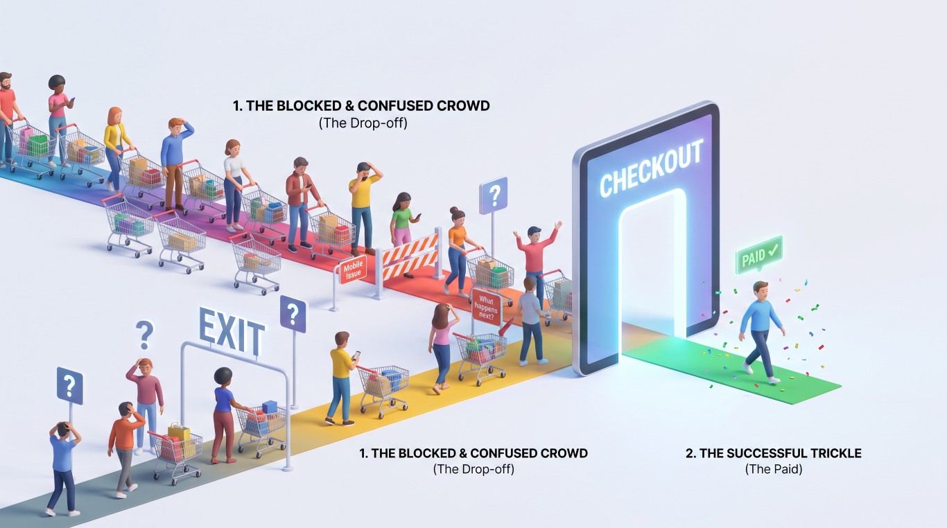
Nobody reaches a payment page by accident. And unless, like my wife, they enjoy filling a cart and emptying it for fun, they got there because they wanted to buy something from you.
Three mistakes cover about 80 percent of what I find when I run a CRO (conversion rate optimization) audit on a website:
- The page is mobile-friendly-ish, but developers being developers, they work on their computer and do the mobile version last, so it is still better optimized for desktop.
- The page is dressed up to look premium without factoring in the user experience.
- Nobody tells the customer what happens after they pay. Seems pretty obvious, right? You would be amazed…
Fix those three and most of the gap closes. There is also a fourth one most stores miss, and I will get to it at the end.
Let’s get into it.
Table of Contents
The buyer at checkout is ready and nervous at the same time
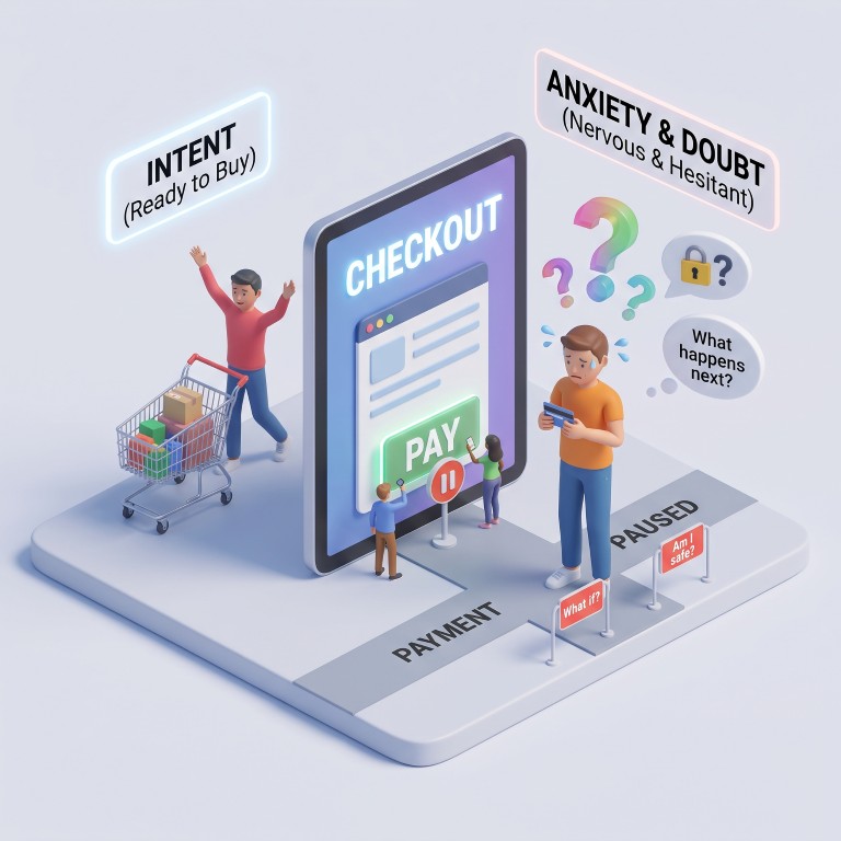
Someone who clicked an ad and got to the payment page has already decided, because there are quite a few steps to get there.
Intent is at its highest at this stage, but so is doubt. Call it anticipated buyer’s remorse (yes, I’m calling it that).
That doubt turns into anxiety, which is also at its highest, especially if you are a new business they met twenty minutes ago.
Handing over the card is not easy in this case, and they are scanning the page for a reason to stop. Between “yes, I’m buying” and “maybe I’ll save it for later”, the phone rings, a distraction… goodbye sale.
The frame I use to judge any checkout in the first minute
The frame is simple: every element on the page either helps the person feel safe or gives them a reason to pause. There is very little neutral ground in between.
So the fix is almost never a bigger button or a new color. It is removing whatever creates doubt at the exact moment the customer is most sensitive to it.
Which mistakes stop your visitors from going all the way?
Mistake 1: the checkout was designed on a desktop
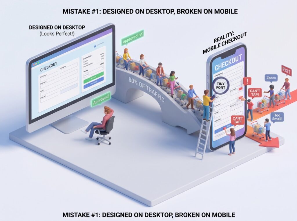
This is the one I find most often. The checkout was designed and approved on a large screen.
I know what you are thinking: who does that in this day and age?
Apparently, quite a few, and I know this firsthand from my own developer. He just cannot seem to remember, after finishing a page, to go back and optimize it for mobile, or better yet, start with mobile.
And it is not only that mobile gets forgotten. A lot of websites skip the designer to save money and go straight to the developer. A one-size-fits-all developer who knows very little about design, so you end up with a below-average checkout page made up of whatever the theme decided to do with it.
Mobile optimized does not mean the page technically loads on a phone. It means someone thought about every detail as it renders on a small screen:
- Font size that can be read without pinching and zooming
- Form and field height that can be tapped accurately with a thumb
- Every single field checked individually, not assumed to be fine because the one above it was
- Proportions and spacing: this is a biggie, and often the hardest to get right
Solution:
The test is simple: add a zero-price item, then ask someone you know to buy it on their phone without telling them why. Preferably someone over 40, we don’t want eagle eyes.
If you find them zooming in to read a label or taking longer than needed to figure anything out, your customers are doing the same thing, and they are not as motivated as your buddy to push through it.
Mistake 2: making the checkout look too polished
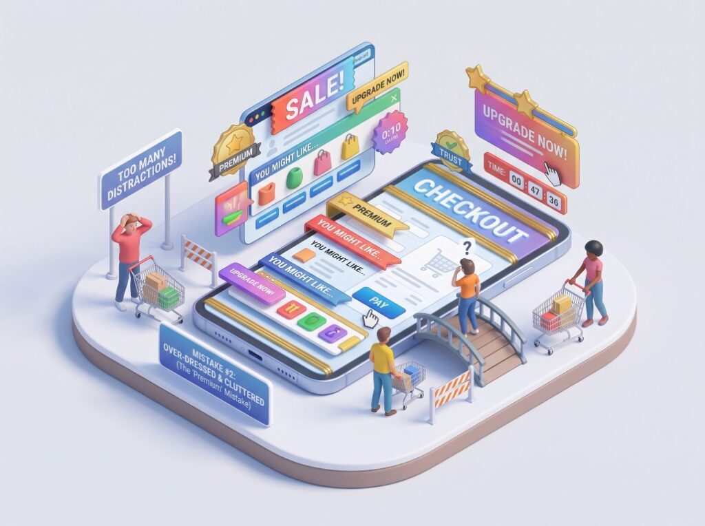
The second mistake usually comes from logical thinking. Someone wants the brand to feel premium at the payment step, or wants to lift average order value, so the checkout gets crammed with promotional blocks, recommendation strips, a big hero announcement, and probably a row of badges.
Each addition makes sense on its own. Together they turn the last page of the funnel back into a browsing page and cause distraction, the last thing you need.
Solution:
Keep it simple. When the user reaches this stage, any new element on the page can pull attention away from the finish line.
It is the same logic as closing a deal, or better put, the moment the client agrees to work with you.
Some green salespeople tend to oversell at that point and keep yapping about how good the product or service is. That creates doubt, and in some cases it gets the client to change their mind.
The best thing to do is thank them politely and literally shut up.
If an element is not helping the person complete the order or feel safe about completing it, it is working against you.
I would rather have a plain checkout that converts than a beautiful one that gets screenshots from the design team. The place to raise average order value is earlier in the journey, not on the page where the card details go.
Mistake 3: Not saying what happens after payment
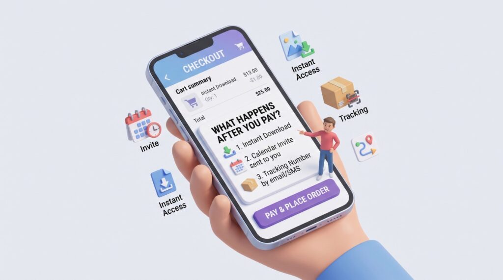
The third mistake is quieter, but it can have quite the effect. The customer is one tap away from paying and has no idea what happens afterward.
That unknown sits right there at the moment they are least willing to take a risk.
Solution:
Say it plainly on the checkout itself, before the payment button, not only in the confirmation email. The customer should know exactly which of these is coming:
- A download, and how they get to it
- A link that gives them access
- A calendar invite for a booked call or session
- A tracking number for a physical item
This costs you one short paragraph of copy. It is the cheapest fix on the list and, in my experience, the one that changes behavior fastest, because it removes the biggest unknown in the whole transaction.
Mistake 4: Reviews and the return policy belong on the checkout too
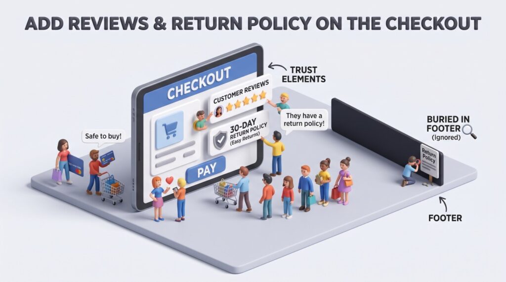
Trust elements are not the same thing as the premium dressing I just told you to strip out.
Placed carefully, they are the elements that seal the deal. Again, the key is to keep it simple and subtle. Whisper, don’t shout.
Reviews earn their space at the payment step, because the buyer is either looking for a reason to bounce or for evidence that other people did this and came out happy. That is a different job from a promotional banner.
The return policy matters just as much. If you have one, keep it next to the product and on the checkout as well. It does not need to be the full legal text on the payment page.
A short summary is enough, because the customer is not reading it word for word. They are skimming at best, checking that it exists.
Most stores have a return policy, but they keep it buried in the footer. That’s just standard, right?
Of course not. The person who actually needs it is sitting on the checkout page with a card in their hand, not browsing your footer.
Solution:
It’s pretty straightforward: add one or two of your top social proof elements close to the action button. The user sees the button and the trust element at the same time and subconsciously links the two.
A review summary, previous clients’ logos, accreditations, or even the number of customers you have served are all big trust signals.
As for the return policy, just having those two words close by increases trust. Same as social proof, the user should be able to see the Purchase button and the element that reduces the risk of buyer’s remorse at the same time.
Conversion rate optimization can be overwhelming, but getting the bare minimum right gets you most of the way.
Frequently Asked Questions
Why do people reach the checkout and then not buy?
Because reaching the checkout means the decision is already made and the anxiety is at its highest, so anything awkward on the page can stop the payment. Three causes cover about 80 percent of the cases I see: a checkout built for desktop when most traffic is mobile, a page cluttered with extra elements, and no explanation of what the customer gets after paying. The fourth is missing trust signals, like reviews and the return policy, right where the customer pays.
Should I design my checkout for mobile or desktop?
Design it for mobile first, then check it on desktop. For most of the stores we look at, around 80 percent of paid traffic arrives on a phone, so the small screen is the real version of your page. Build and approve it on a phone and the desktop version tends to take care of itself.
Do upsells and premium design on the checkout raise average order value?
We think they do more harm than good at the payment step. Every extra element competes with the one action you need, and the customer at checkout is the most sensitive they will be all journey. Put your upsells on the product page or in the cart, and keep the payment page for paying.
What should I tell customers before they pay?
Tell them exactly what they will receive and how it reaches them, in one plain sentence above the payment button. A download and where to find it, a link, a calendar invite, or a tracking number. It costs you one line of copy and it removes the biggest unknown in the transaction.
How do I know if my checkout is the problem and not my ads?
Look at how many people reach the checkout page against how many complete the order. If the traffic landing on checkout is healthy and the order count stays flat, the ads did their job and the page is losing people who had already decided to pay. Session recordings will usually show you where they stop.
What to fix first
Start with the phone. That is where most of your traffic is and where the biggest losses are. Fix anything hard to read or hard to tap.
Then strip the page back to what the customer needs to pay and to feel safe paying.
The copy fixes come last: one plain sentence about what arrives after payment, a short line about returns, and your reviews where the customer can actually see them.
Why last? Because a broken mobile form loses people before they ever read your copy.
If you are buying traffic and sending it into a checkout that loses ready buyers, you are paying twice for the same problem.
If you want to do it yourself and need someone to walk you through it, we are happy to do consultation only. And if you want a second pair of eyes on yours, book a free consultation and we will go through it with you.