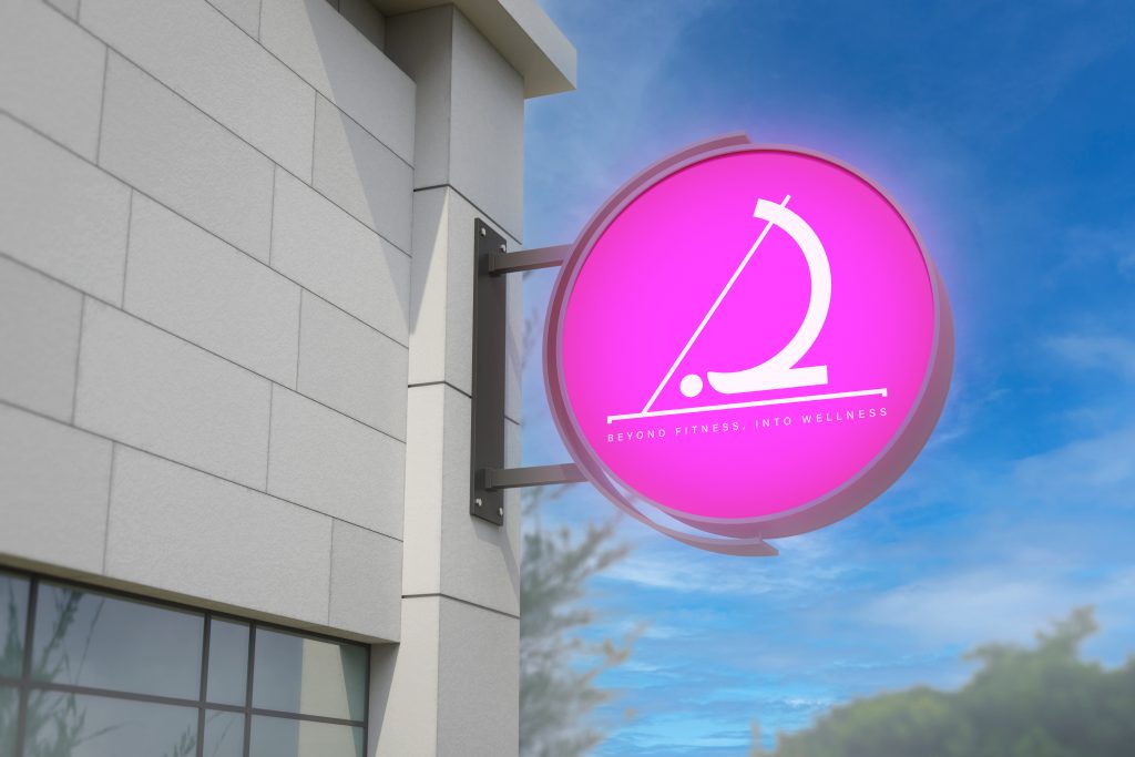
Home » Our Work » Le Club Pilates A Brand That Thinks Differently From Idea to Refined Wellness BrandTurning a studio idea into a brandPilates Club approached Fatcow Digital before they had even opened their doors.With only a name, a wellness brand was built.We crafted a unique voice capturing their approach and spoke to their audience.Fatcow Digital did more than create a simple logo. Clients: PILATES CLUB Project Type: Branding Date: 2024-10-31 Address: BEIRUT Link: @pilatesclub.lb Building Movement into the LogoInspired by movement and balancePilates Club’s logo captures the essence of the studio’s exercise.The “I” was stylized to picture a person mid-Pilates pose on the reformer machine.Placed within a rectangular frame, the logo communicates alignment and control. The essence of a well-executed Pilates sequence.The soft, feminine palette of pink and gray is elegant and empowering to define the wellness space of the studio. Guidelines With Ready-to-Launch ContentLaunching with impactAfter defining the core identity, the visual style was established.A month of social content in the newly-defined brand voice was ready to launch.Modern typography and thoughtful spacing allowed design elements to support a brand that focused on more than fitness.Wellness, balance, and beauty in motion became the core. Get started with a Free consultation Book A Meeting