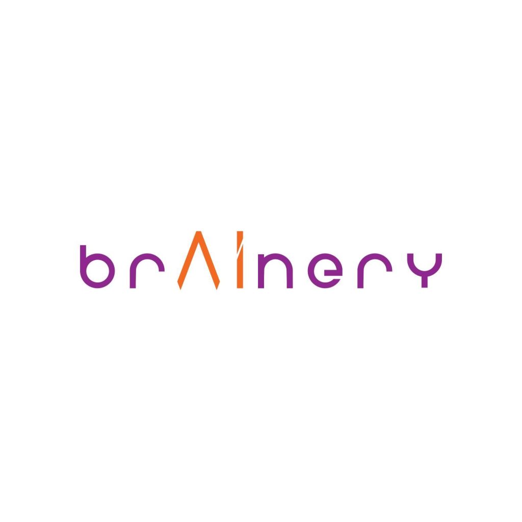
Fatcow Digital crafted a modular logo to reflect Brainery’s mission.
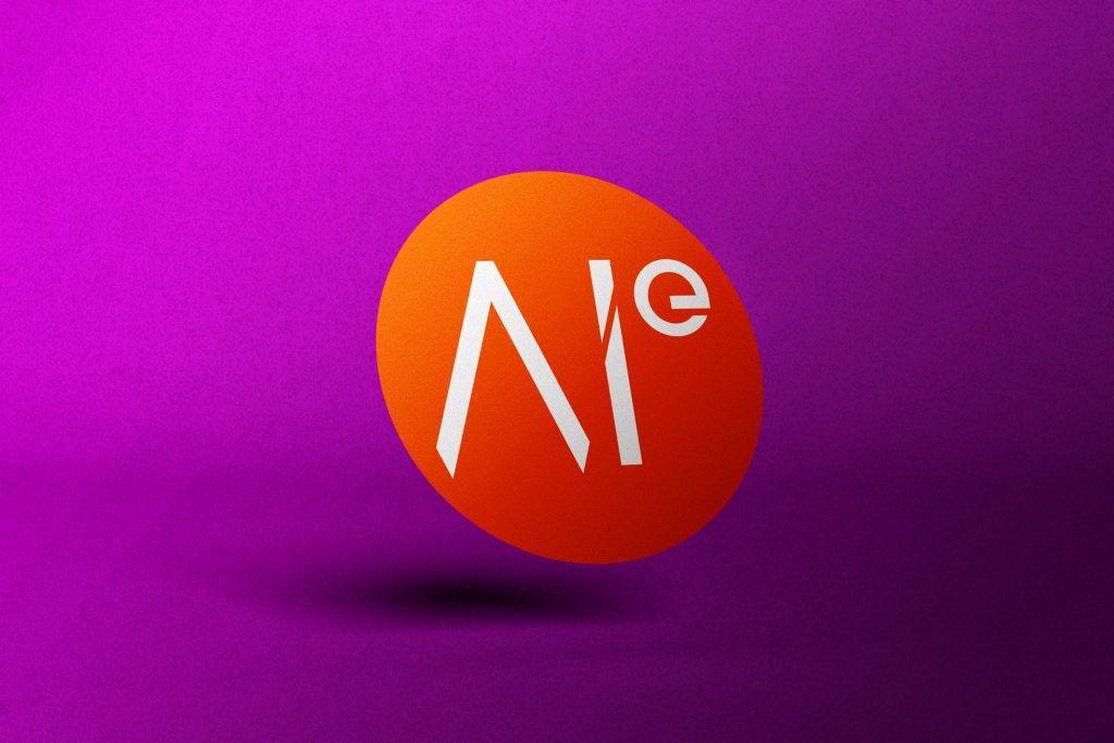
Rectangular frames convey open-mindedness and structured growth. The custom-made “A” and “I” nod to AI, tech, and continuous learning. The rounded letterforms also used balanced clarity with approachability.
Guidelines for Clarity, Energy, and Confidence
Consistency and Creativity, Hand in hand
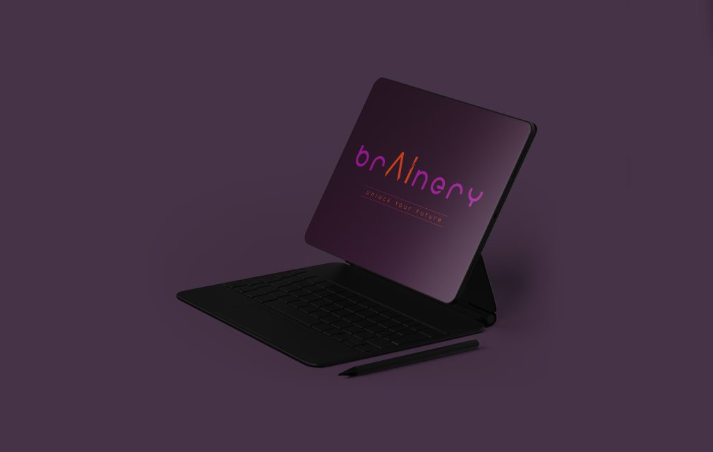
Fatcow Digital chose a bold, vibrant palette to keep branding consistent across print and digital format.
The typefony chosen kept a modern touch that is easy to read.
Iconography and layout rules were also set to ensure Brainery’s values of accessibility, clarity, and progress.