Amy’s Wall had grown past its initial product offering
Amy’s Wall began as a small studio focused on handcrafted wall art. Over time, the brand started offering functional and decorative home accent pieces, like vases, candle holders, and small furniture.
But, while more products were being offered, the branding stayed the same; still stuck to the idea of “wall-only” decor.
Amy’s Wall gave Fatcow Digital a clear goal: Upgrade the brand to reflect the broader vision without forgetting its roots behind.
Logo Design: Balancing Elegance With a Flexible Design
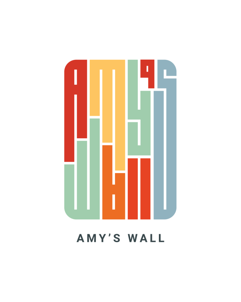
A Logo That Acts Like Art
Fatcow Digital designed a new logo from scratch.
At the heart of the rebrand is a modular, rectangular logo designed to feel like a piece of art. The logo reflects Amy’s Wall’s mission to help curate expressions of personality in everyday spaces.
The built-in versatility let’s the logo pop wherever it’s displayed. Large displays, packaging, social icons – it is able to keep its artistic presence.
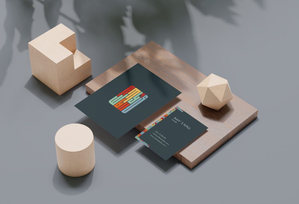
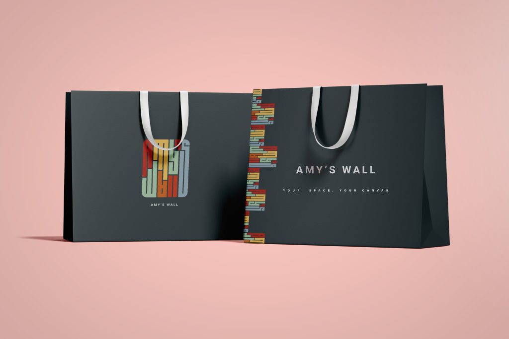
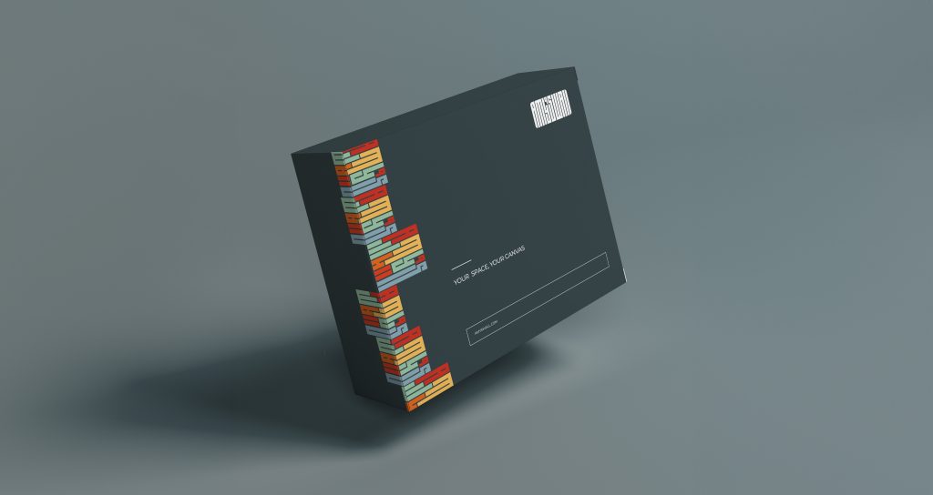
Brand Guidelines: Supporting Growth
Consistency and Creativity, Hand in hand
A color palette was defined to evoke comfort and character was define. Monochrome versions of the logo and rules on when to use them were also explained.
These guidelines let Amy’s Wall stay visually cohesive across mediums and placements.